

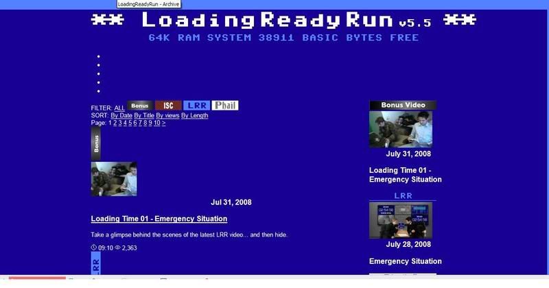
I LOOOOOOVE the new LRR layout. It is very pleasing to the eyes and extremely easy to read. I also enjoy how it became insanely easier to find videos and color codes them by type.
Good Job LRRcast!
David
New LRR layout.
New LRR layout.
David E Gray

-
Hector Ramirez

- Posts: 2
- Joined: 11 Jan 2007, 13:00
- Location: Mexico
-
Hero of Canton

- Posts: 98
- Joined: 23 Sep 2007, 16:06

-
CaesarMagnus

- Posts: 93
- Joined: 21 May 2007, 14:26
- Location: Texas
-
Tensen01

- Sketchasaurus Rex
- Posts: 1783
- Joined: 27 Sep 2004, 20:10
- First Video: Who Watches Movies?
- Location: Colorado
- Contact:
Graham wrote:Tensen01 wrote:And what happened to the whole "No ads ever" policy.
This was never a policy.
I must have misheard,... I just thought I recalled something to that effect being addressed in a LRRcast hmmm... Oh well.
I dunno... It's just for some reason making me physically upset to look at the site and I'm lashing out.


Well we'd rather not have ads at all. But there's the video ads. And the one on the forums. We've been weaning you guys in.
Basically they are a necesary evil. If we can make money from them, we need to.
As for other complaints, we spent a loooooong time perfecting the design. We have also lived with it for a while, seeing how it holds up. We like it a lot.
But let us know.
Basically they are a necesary evil. If we can make money from them, we need to.
As for other complaints, we spent a loooooong time perfecting the design. We have also lived with it for a while, seeing how it holds up. We like it a lot.
But let us know.


-
Cureless_Poison

- Posts: 1233
- Joined: 18 Jun 2008, 02:42
- First Video: Fun with microwaves.
- Location: BC, Canada
- Contact:

-
Lord Chrusher

- Can't Drink Possible Beers
- Posts: 8913
- Joined: 29 Apr 2005, 22:53
- First Video: Door to Door
- Location: In England.
One minor thing that bugs me is how thick the bars are between post in treads in the forum. They seem to waste a lot of space.
Also when I am posting a reply I am getting black text for the body of posts in the Topic review section.
Also when I am posting a reply I am getting black text for the body of posts in the Topic review section.

We are all made of star dust. However we are also made of nuclear waste.
Remember to think before you post.

-
Pretzelcoatl

- The Feathered Pretzel
- Posts: 110
- Joined: 30 Mar 2007, 23:31
- Location: Hangin' with the cool kids.
I preferred the older layout, particularly the borders around the recent videos. Never fear, I bet this one will grow on me in a few weeks!
But would it kill you to put some Penrose tiles in there?
But would it kill you to put some Penrose tiles in there?
"Let us prepare to grapple with the ineffable itself, and see if we may not eff it after all."
~Douglas Adams
~Douglas Adams
-
CyberTractor

- Member of Alpha Flight
- Posts: 3052
- Joined: 23 Jan 2007, 14:48
- Location: Melbourne, Florida
- Contact:

-
CyberTractor
- Member of Alpha Flight
- Posts: 3052
- Joined: 23 Jan 2007, 14:48
- Location: Melbourne, Florida
- Contact:

Pros:
-I like that you finally integrated the Iron Stomach videos, so I don't need to go elsewhere to see if you updated.
-And the updated About and Videos pages are nice.
Cons:
-I can see where people get the "cluttered" feel. It will take some getting used to.
-The ad does kinda stick out, I guess that's the point.
-I like that you have a Blog thing on the main page, but maybe you could put up links the the other new blogs. On the blog page itself or in the About section, maybe?
Overall, it's ok. I think I'm already getting used to it. Now wheres today's update?
Tacos?
-
Joystick Hero

- Posts: 266
- Joined: 26 Jul 2008, 14:53
- Location: Minnesoooota
- Contact:
Personally, I think I like it. I mean, it will take a bit to get used to it, what with being used to how it used to look and all, but I think it's dandy. I'm a big fan of having all the videos in one place (which now that I think of it, only the Iron Stomach ones were separate before) and I like the color coding.
Other than that, I have nothing to say against it really, other than the strangeness of a new format. I'll get over that though.
Other than that, I have nothing to say against it really, other than the strangeness of a new format. I'll get over that though.


The initial load spun my head. Now that I look through it again, the only things I really think could be improved upon, but I will end up getting used to, regardless of what is done, are:
1) Bring back the Shorts/Music/Stupidity/Etc. tags.
Never have I loaded LoadingReadyRun.com, saw the LoadingReadyRun banner at the top, and wondered if the video I was watching was indeed, LRR.
2) Recent videos next to recent videos.
This is what really drags my eyes to the right side of the page. The newest weekly video is obviously going to be right there, so that will always be visible, and unless you are planning on letting the Phails drop from most recent underneath the videos, the only thing that would need to be in that box on the upper right is Iron Stomach.
BUT! You now seem to be holding the ISC videos on LRR.com, so if you're going to show those on the list of most recent videos then that entire box can be gotten rid of, and I think will get rid of a lot of the "cluttery" feel.
Return to “General Discussion”
Who is online
Users browsing this forum: No registered users and 55 guests